
IELTS Academic Writing Task 1: writing a good, strong answer for a line graph; with details and tips
This is an IELTS Writing Task 1 post on writing a good, strong answer for a line graph. This post will also help you to write an answer to a column graph too. The details of a line graph, that is, introduction, overall trend or summary, and detailed trend have been discussed here. You will also find a good model answer for the discussed picture.
Let’s have a look at how to write a good and solid answer to a Task 1 question.
Let’s look at a question first.
You should spend about 20 minutes on this task.
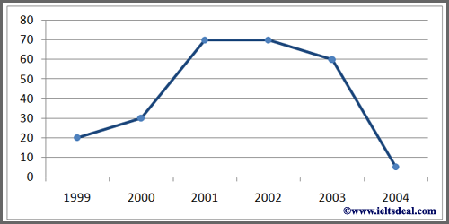
The line graph below shows the number of workers in a spinning mill in Westferthing from 1999 to 2004.
Summarise the information by selecting and reporting the main features, and make comparisons where relevant.
Write at least 150 words.
In this question, we can see that we are given a small amount of data to present a report. However, we must write at least 150 words.
We have to set a plan on how to write 150 words for both short pictures and big pictures.
In my opinion, we should write an answer with 2 paragraphs.
This is how the model answer can look.
| Paragraphs | What to write |
| Paragraph no. 1 | Introductory statement with an overview.
Introduction: Paraphrase the given title. (Never copy the title. You will be penalized if you do so.) Overview: Provide an overall statement or summary of the picture. |
| Paragraph no. 2 | Write a detail of the given picture. Understand every point and angle clearly before you write. This will help you to find important points to write for the answer. |
You do not need a conclusion unless there is a need to write more. You can write a conclusion only when you are short of some words.
So, let’s start writing the answer to the given picture.
Introduction:
Here is a model INTRODUCTORY STATEMENT.
| The displayed line graph illustrates the number of people who worked in a spinning mill in Westferthing between 1999 and 2004. |
You can see the sentence has been changed in some places and it looks different from the title.
Now, we should provide an overview.
Overall trend/ Overview/ Summary:
Before doing that we need to know about some important matters and vocabularies for line graph and column graph.
Trends:
Every line and column graph has some trends to explain. Here is a list of trends that you can find in a line or column graph.
| TRENDS | |
| Increasing trend: | 
Slow increase |

Rapid increase |
|
| Decreasing trend: | 
Slow decrease |

Rapid decrease |
|
| Stable trend: | 
Stability, No change |
| Fluctuating trend: | 
Fluctuation |
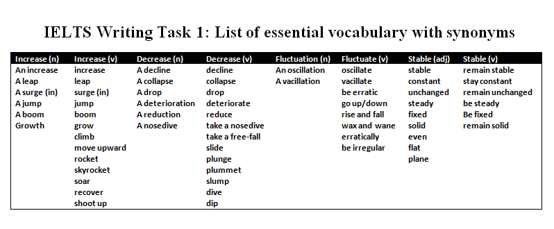
To describe these trends, you need to use different synonyms.
Here is a list of synonymous words for the given trends in a line graph or column graph.
 Now, as we have learnt about the trends and their languages, we can write the overview or overall trend.
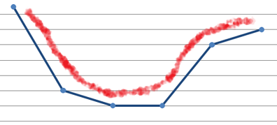
Let’s take a look at the picture again.
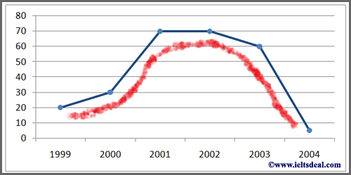
You can see that I’ve drawn a red line just beneath the line and it looks like the shape of a cap. If you find something like this, you can write an overview easily.
Take a look again. It appears that the given data increases at first and decreases at the end. It also seems that there is a stable trend in the middle. So, we have to put all this information together and we shall get our overall trend/ overview/ general trend.
Here is a model OVERALL TREND for you.
| Overall, the number of workers in the spinning mill developed at first and declined at culmination with a stable trend in the mid-level. |
This line clearly describes, in brief, the complete picture of the given graph.
For other types of pictures, the overall trend will be different. Even in some pictures you need not provide the overall trend.
Now, let’s flip the picture so that it becomes a completely opposite one.
Again, you can see that I’ve drawn another red line just beneath the line and it resembles the shape of a cup. If you find a graph like this, you can write an overview following the above-described method.
Take a close look. It appears that the given data decreases at first and increases at the end with a stable trend in the middle.
So, here is a model OVERALL TREND for you, which will be just opposite of the previous overall trend.
| Overall, the number of workers in the spinning mill declined at first and developed at culmination with a stable trend in the mid-level. |
Description:
Now, we need to write the detail of our main picture.
Let’s have a look at the picture again.
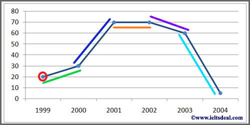
You can see some colored highlights in the picture.
These are the points on which we are going to write the details.
Let’s have a close look at the colored points.
- The red circle – the starting point – workers’ number-20, time-1999.
- The green line – first increase –workers’ number from 20 to 30, time 1999-2000.
- The blue line – second increase –workers’ number from 30 to 70, time 2000-2001.
- The orange line – stable trend –workers’ number remains at 70, time 2001-2002.
- The purple line – first decrease –workers’ number from 70 to 60, time 2002-2003.
- The sky-blue line – second increase –workers’ number from 60 to 5, time 2003-2004.
So, these are all the points that we need to detail in our writing.
Let’s write it. Don’t be scared if you can’t write properly at first. It happens to everyone. We need to move slowly but not too slowly.
Here is a model DESCRIPTION of the picture.
| As is observed in the graph, the number of workers in the spinning mill was only 20 in the year 1999. The workers’ number improved slowly from 20 to 30 between 1999 and 2000. From 2000 to 2001 the number boomed from 30 to 70. For the next year, there was no change at all in the figure. The following year the number went down gradually from 70 to 60. At the end of the timeline (2003-2004), the workers’ number plummeted from 60 to only 5 approximately. |
So, if we count the number of words, we may find out that we could not write 150 words.
What should we do now? Should we keep it this way?
Unfortunately, if we do this, we will be penalized.
We must think about something to add to this answer.
Conclusion:
Let’s look at the picture again. Can you spot the highest and the lowest point of the picture?
It looks like the highest number of workers worked in the mill during the 2001-2002 time period while the lowest worked in 2004.
Let’s add that as a conclusion.
So, here is a model CONCLUSION. Remember, you do not need this unless you are short in word-limit.
| In fine, the graph shows that the highest number of workers served in the mill during 2001-2002 while the lowest worked in 2004. |
Here we have a total of 155 words. However, hopefully, you need not worry about word-limit because most of the time there are lots of information to cover in the given picture or pictures.
Now, let’s have a look at the complete model answer.
| The displayed line graph illustrates the number of people who worked in a spinning mill in Westferthing between 1999 and 2004. Overall, the number of workers in the spinning mill developed at first and declined at culmination with a stable trend in the mid-level.
As it is observed in the graph, the number of workers in the spinning mill was only 20 in the year 1999. The workers’ number improved slowly from 20 to 30 between 1999 and 2000. From 2000 to 2001 the number boomed from 30 to 70. For the next year, there was no change at all in the figure. The following year the number went down gradually from 70 to 60. At the end of the timeline (2003-2004), the workers’ number plummeted from 60 to only 5 approximately. In fine, the graph shows that the highest number of workers worked in the mill during 2001-2002 while the lowest worked in 2004. |
This is how you can write a good, strong answer for a Task 1 picture.
Bonus tips:
There is no difference between a line graph and a column graph. Both of them are the same.
Take a look at this post for details on similarities between the line and column graph.